For the colored version of the logo, I took inspiration from the original vector-based logo the podcast was using. I converted the colored buttons above the coffee mug into similarly colored steam wisps to add a hint of their original intent without making it too blatantly obvious. I chose to go with an Overwatch-inspired font to stay in keeping with their gaming theme, but modernize the overall look and feel.
To best suit the needs of the client, I provided a “colourless” option without a background fill. The clean and precise linework allows the logo to be resized and manipulated for use in many different ways and medium. The gaming font worked well with the shape and feel of the logo because of it’s similarly clean and precise lines. The coloured steam is an important design characteristic that should be carried over into the “colourless” version of the logo to ensure that the four-button controller colour is still communicated.
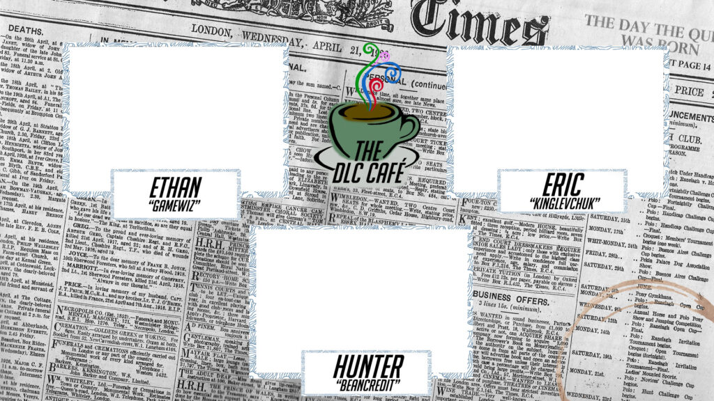
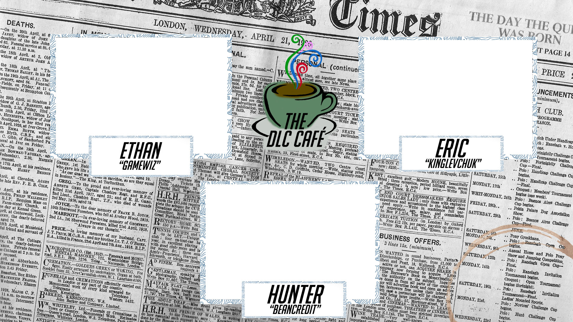
This is the stream overlay I designed for The DLC Cafe to use during their live broadcast.
For the main broadcast overlay of The DLC Cafe, I decided to stay in keeping with the Coffee Shop / News theme they previously had. I used an old New York Times newspaper as the background for the overlay. Using the newspaper allowed me to easily fill a normally large and empty space with an interesting and thematic design. I added the coffee stain as a bit of additional detail and depth to the background. This should bring the viewer to a mental place where they are at their table reading their newspaper with a coffee in hand consuming the latest news but in today’s digital landscape. The textured borders of the camera and title boxes add a visual hierarchy and draw the viewer’s attention to the important information inside the broadcast. I centered the logo statically to ensure that it was a prominent and persistent element in the broadcast, in case the broadcast is clipped or shared elsewhere.